Brand Identity System
Logo
Introducing Symetri Canada & Logo Usage Guidelines
As SolidCAD transitions into Symetri Canada, it is important that we maintain brand consistency while gradually building recognition for Symetri across the Canadian market.
How to Refer to the Company
During the transition period, the organization may be referenced as:
- SolidCAD
- SolidCAD, A Symetri Company
Both versions are correct and should be used depending on the context. This helps reinforce familiarity with the SolidCAD brand while introducing the Symetri connection.

SolidCAD & Symetri Logo Usage
For the time being, both logos should be used together in branded materials where applicable.
Key guidelines:
- Use the SolidCAD logo alongside the Symetri logo to support brand recognition during the transition.
- This applies to presentations, marketing materials, event assets, and digital communications.
- The transition to Symetri Canada as the primary brand will occur in phases and will be directed by the SolidCAD Marketing team in coordination with the Symetri Global team.
French Usage
At this time:
- There is no French variation of “Part of Addnode Group.”
- The phrase should always remain in English when used with the Symetri brand.
Visual Alignment
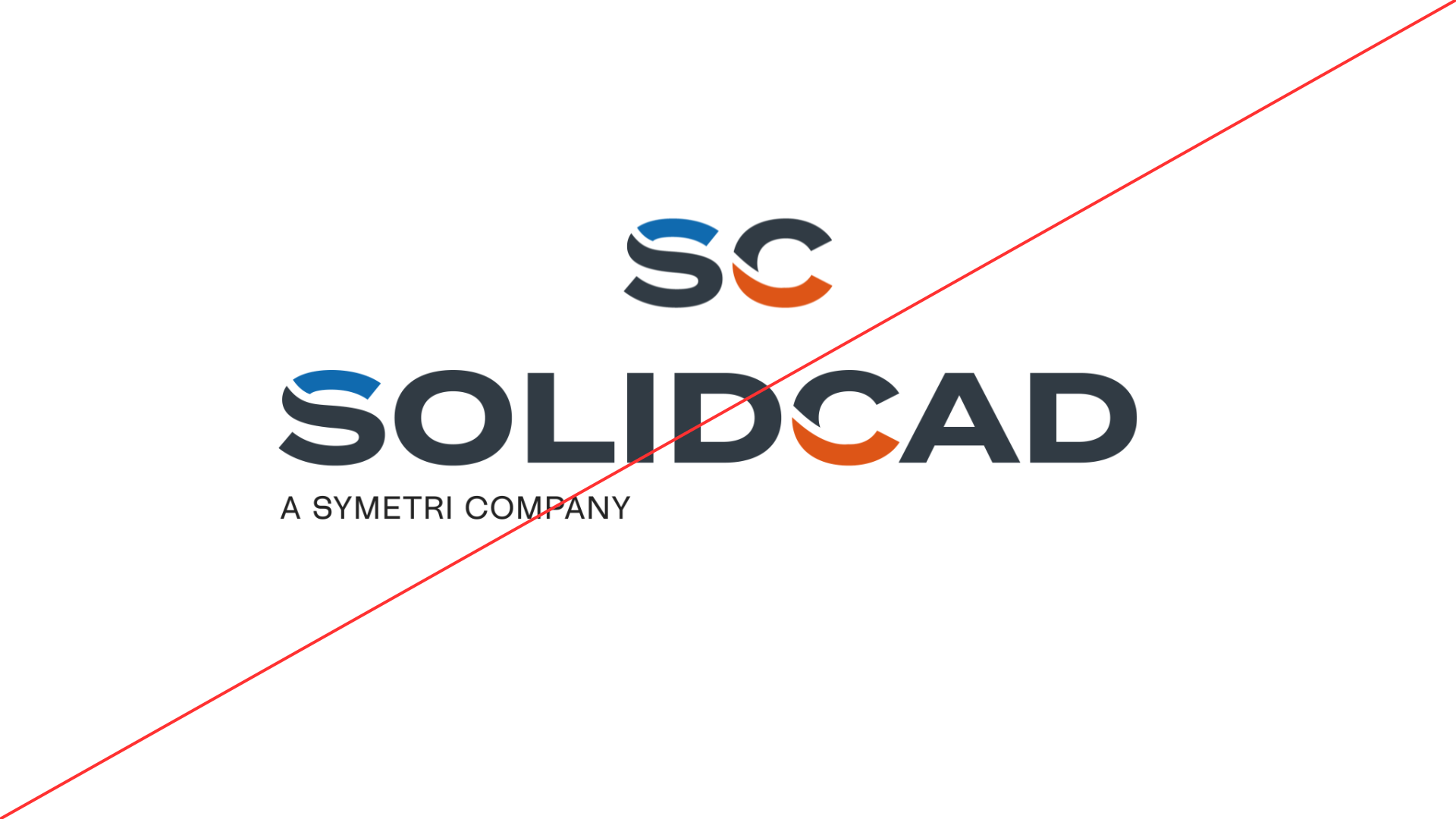
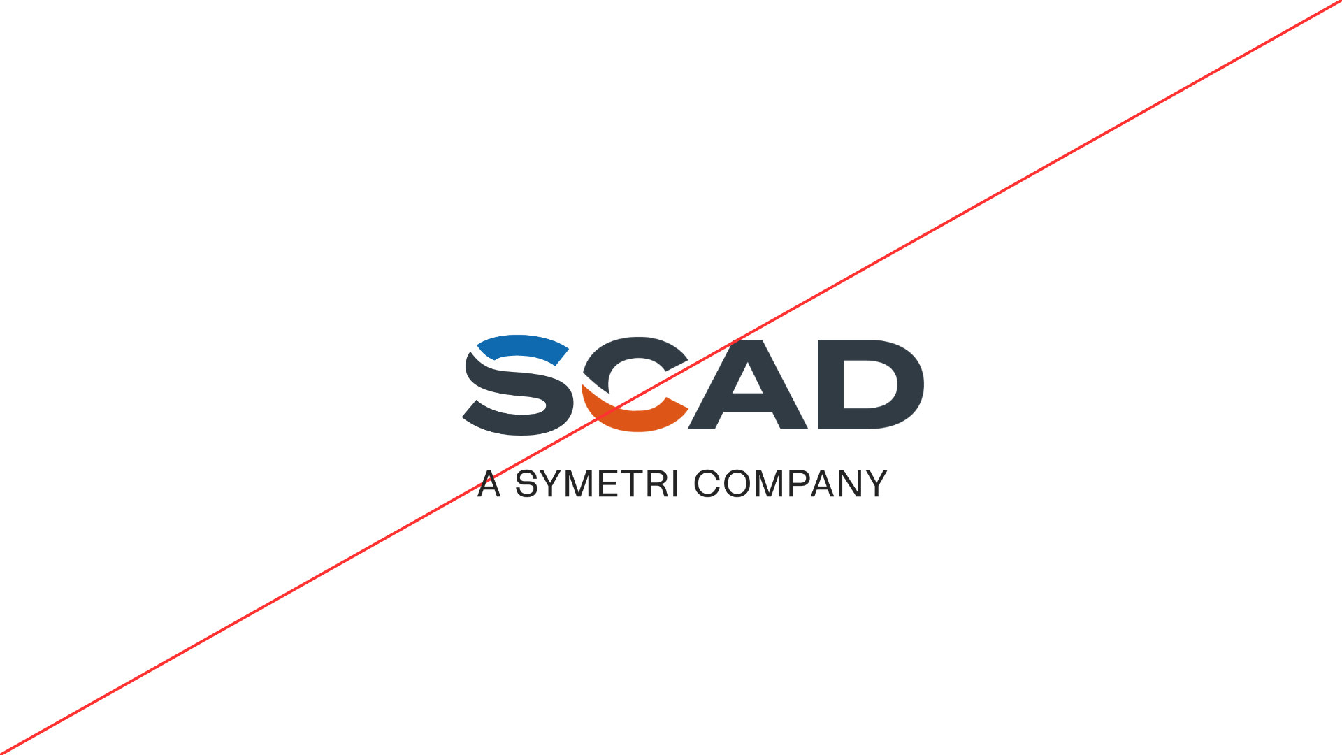
When displaying the SolidCAD and Symetri logos together, the logos should be scaled so that their visual height aligns, creating a balanced and unified appearance.
Because each logo has different proportions, the logos should be adjusted optically rather than by exact percentage scaling.
The goal is to ensure that:
• The cap height of the main wordmarks appears visually aligned
• Neither logo appears dominant or compressed
• The combination feels balanced across layouts

Standard Co-Brand Lockup
The preferred format places the logos side-by-side separated by a vertical divider.
Structure:
SolidCAD logo on the left
Symetri logo on the right
Divider line between the logos
Taglines should remain directly beneath their respective logos:
- A Symetri Company
- Part of Addnode Group

Divider Usage
A vertical divider helps clearly distinguish the two brands.
Divider guidelines:
• Center vertically between both logos
• Use brand accent color (orange)
• Maintain equal spacing on both sides
Recommended spacing:

To support brand familiarity, we have created a logo animation that includes both the SolidCAD and Symetri logos.
This animation should be used:
- In video intros
- Webinar openings
- Presentation introductions
- Digital media where motion graphics are appropriate
The animation helps visually connect the two brands while reinforcing the transition.


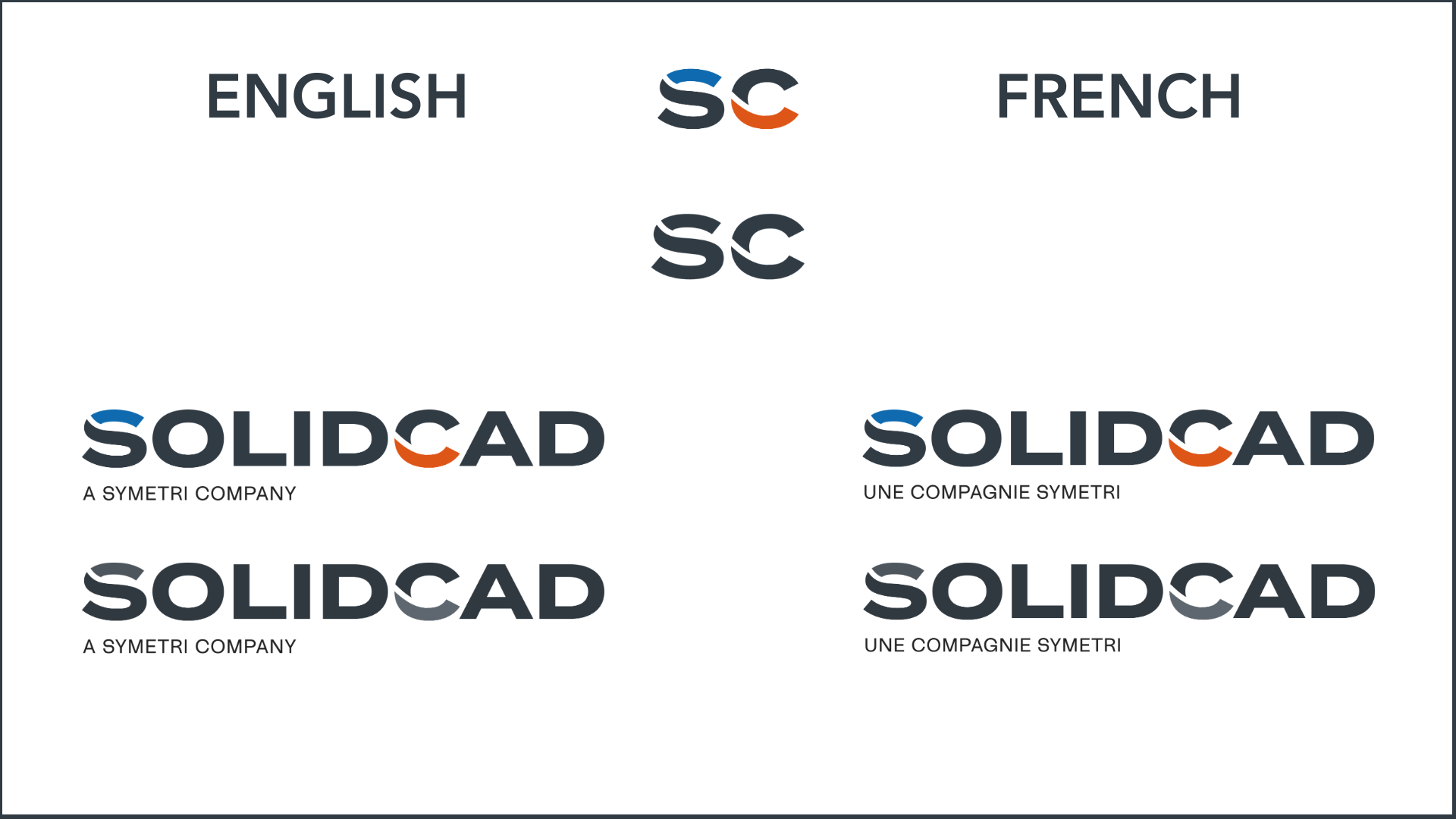
- Dark Logo on White Background:
- Application: The dark version of the SolidCAD logo is designed for use on light or white backgrounds to ensure maximum visibility and contrast. This version should be your default choice for most standard applications where the background is light, ensuring the logo stands out clearly and maintains its integrity.
- Clear Space: Maintain adequate clear space around the logo, equivalent to at least the height of the letter 'S' in SolidCAD, to ensure the logo’s visibility and impact are not compromised.
- Minimum Size: The minimum size for the dark logo on a white background should not be less than 1 inch in width for printed materials or 72 pixels for digital applications, to preserve legibility.
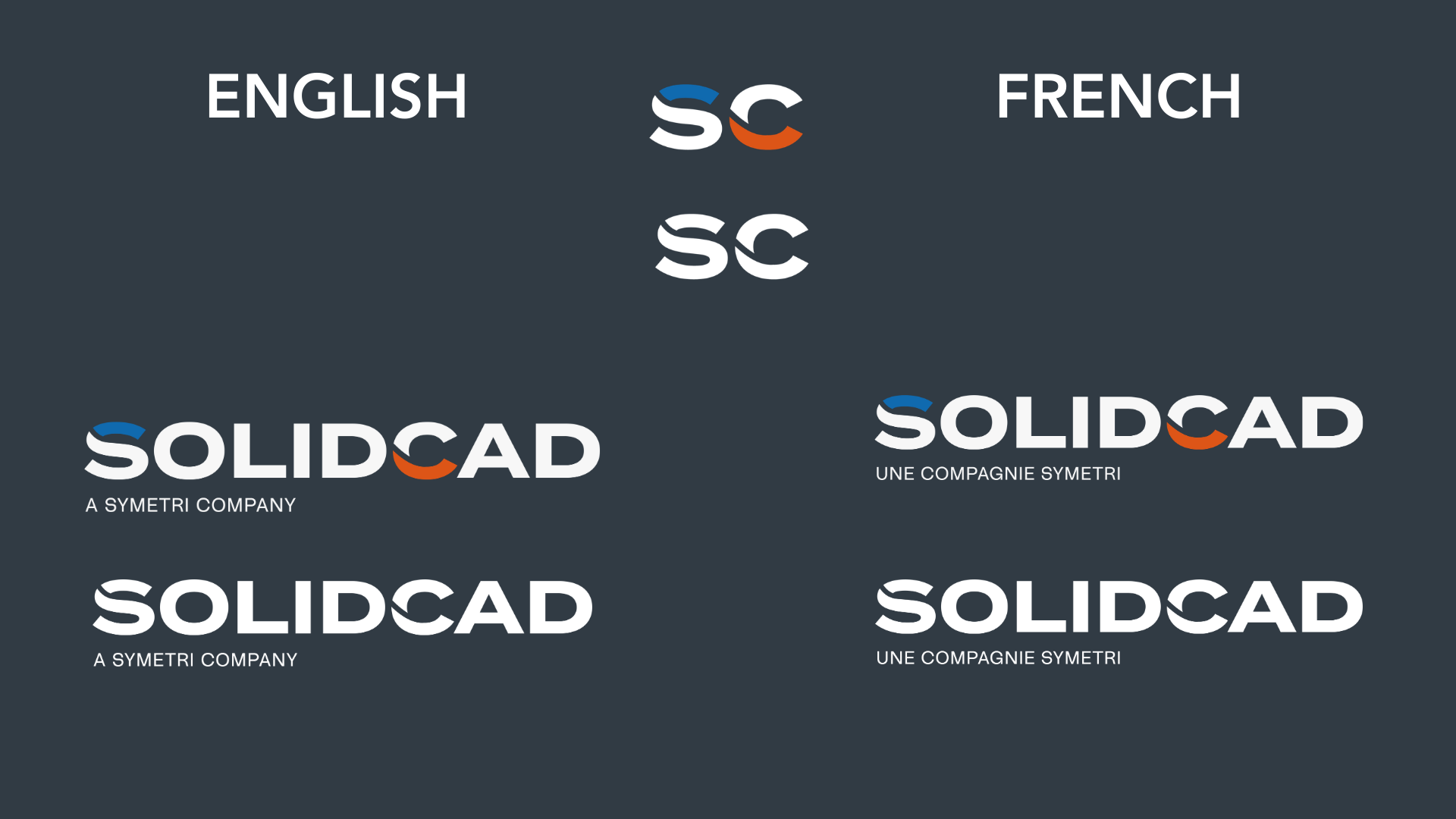
- White Logo on Dark Background:
- Application: The white version of the SolidCAD logo is optimized for use on dark or coloured backgrounds. This ensures the logo remains prominent and legible against darker hues, providing a stark contrast that captures attention while maintaining brand consistency.
- Clear Space: Like the dark logo, ensure a minimum clear space equivalent to the height of the letter 'S' in SolidCAD around the logo. This space is crucial to keep the logo distinct and separate from other design elements.
- Minimum Size: For the white logo on dark backgrounds, adhere to the same size guidelines as the dark logo version—no less than 1 inch in width for print or 72 pixels for digital displays, to ensure the logo's details are discernible.


Full Logo
- Employ the full logo in contexts where our brand needs to be recognized and understood, such as in corporate communications, official presentations, marketing materials, on our website, and in physical signage. It’s crucial for spaces where the impact and details of our logo are visible and can be fully appreciated.
- The full logo symbolizes our complete brand identity and should be used when there's enough space to maintain its integrity and legibility.
-1.png?width=167&height=74&name=Empowering%20Transformation%20-%20logo%20transition%20animation%20(7)-1.png)
Favicon
- The favicon, a smaller icon version of our logo, is designed for digital spaces where size is limited, including browser tabs, bookmark bars, and mobile apps. It’s a tool to help users quickly identify our brand in a sea of tabs and bookmarks.
- Use the favicon to maintain a visual presence in the digital environment, ensuring our brand is easily recognizable even in the smallest of spaces.

Important Notes
- Platform Appropriateness: Always choose the logotype that suits the platform you're working with. The full logo is for broader brand communication, while the favicon excels in digital navigation.
- Visibility and Legibility: Ensure the logo you use is appropriate for the size and visibility of the space. The details of the full logo must be clear; if space is too constrained, opt for the favicon.
- Consistency is Key: Whether using the full logo or the favicon, ensure it aligns with our brand’s style and colour scheme. Consistency across all touchpoints reinforces our brand identity.
Brand Colours
SolidCAD is your partner for technology consulting and thought leadership. We help our clients "Design, Collaborate, Make, and Manage," while driving digital transformation across various Industries. What sets us apart is our unparalleled expertise and diverse and dedicated talent with a client-centric approach. Our identity is defined by our commitment to collaborative teamwork with our clients and our people, representing a history of proven success.
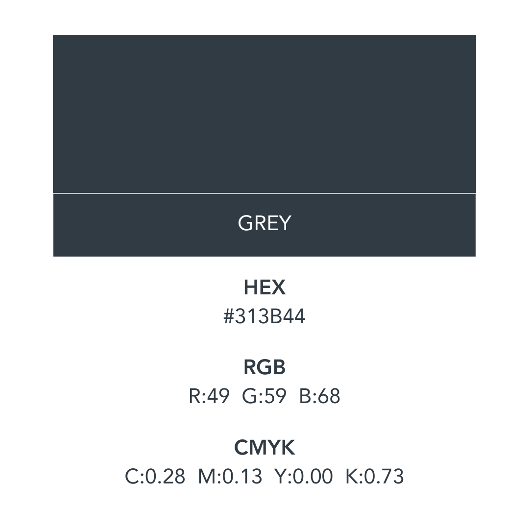
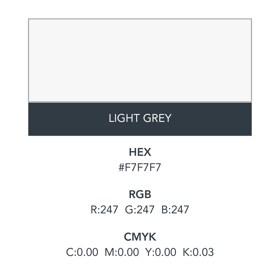
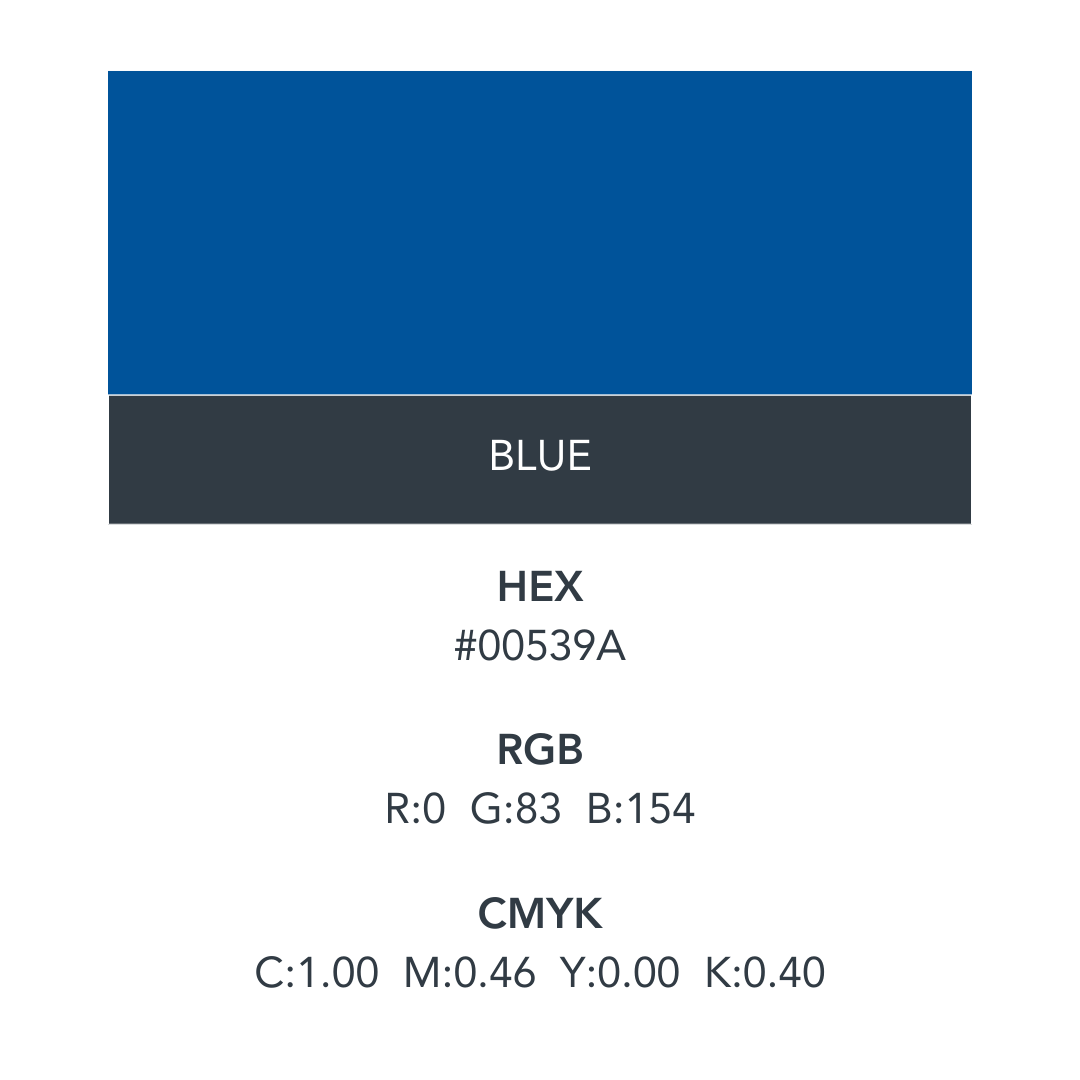
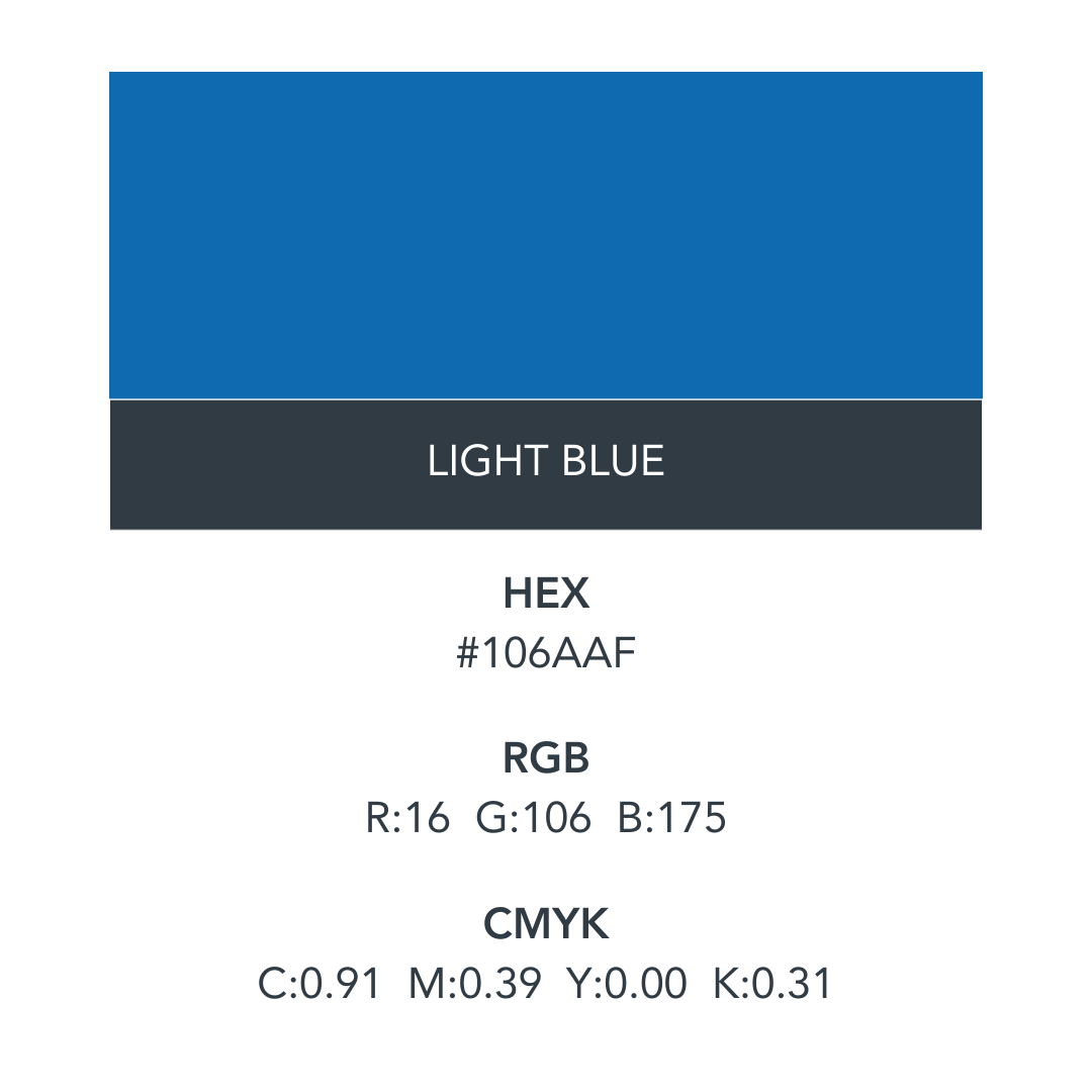
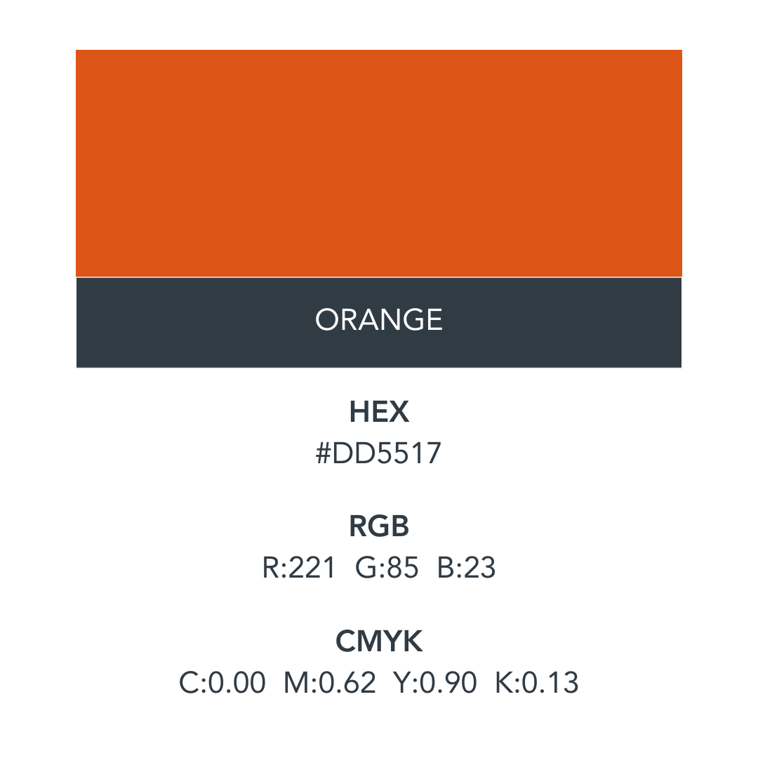
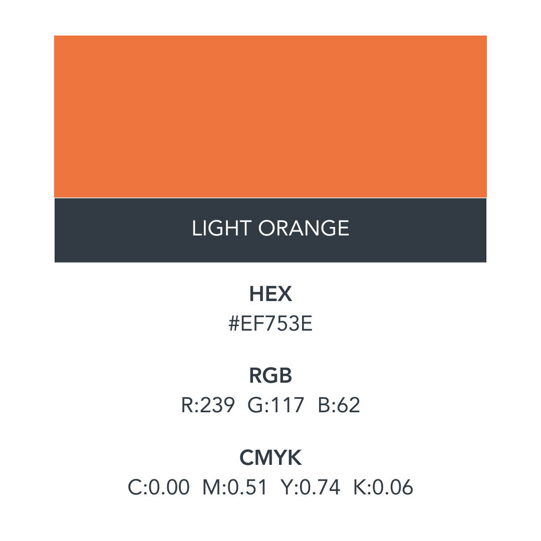
- symbolizes compromise, neutrality, control, and practicality.
The psychology of the colour:
When combined with other colours, gray can be used across any industry. It’s mostly popular among financial or technology businesses, however, or any brands wishing to convey maturity, professionalism, and respectability.
- symbolizes security, trust, loyalty, and responsibility.
The psychology of the colour:
Blue has a calming and tranquil effect on our psyche. It's a non-threatening and predictable colour, thus making us feel safe. Because blue conveys trust, honesty, and dependability, it helps to build customer loyalty. It is not only encourages feelings of peace and relaxation, but also inspires honesty, and wisdom.
- symbolizes emotion, youth, optimism, and enthusiasm.
The psychology of the colour:
Orange encourages extroversion as well as appetite. It’s full of vitality and helps to bring our physical and mental energies into balance. Because it increases our courage, orange also encourages us to take necessary action.
With the launch of our new brand identity and website makeover, SolidCAD is embracing a fresh look, complete with a new brand image and font. We've chosen Avenir Pro LT as our go-to font, a choice inspired by its name, "Avenir" – the French word for "future". This font beautifully captures the spirit of the geometric sans-serif styles born in the 1920s, marrying the charm of the past with our vision for the future.
Avenir Pro LT has earned its stripes as a favourite among many leading corporations for its blend of style and functionality. Its clarity and ease of reading make it perfect for everything from bold headers to detailed body text, allowing us to communicate clearly and effectively.
To ensure our brand speaks in one voice, we're asking all SolidCAD team members to use Avenir Pro LT in all our internal and customer-facing materials. And, to make things as smooth as possible, we've made sure Avenir Pro LT is fully compatible with all MS Office products. This means whether you're drafting a document or crafting a presentation, incorporating our brand font will be a breeze. This step is more than just about consistency; it's about proudly showcasing who we are and where we're headed, with every word we write.


Avenir LT Pro could be used in white on the SolidCAD blue. The font
should be a minimum of 12 points to ensure legibility.
Avenir LT Pro can be used in callouts. A colour choice may include the SolidCAD blue.
The font should be a minimum size of 12. May be italicized.
From emails and marketing to internal documentation, the way we communicate should always reflect who we are: calm, clear, and human.
Our language is simple, direct, and purposeful. We focus on helping people understand what matters, why it matters, and what to do next.
| What We Do | What It Looks Like |
|---|---|
| Speak plainly | We avoid jargon, buzzwords, and overly technical language. We say what we mean and explain why it matters. |
| Provide clarity | When introducing ideas, changes, or technology, we focus on the impact for people and teams—not just the systems. |
| Reassure, don’t overwhelm | Our messaging is thoughtful, transparent, and paced. We communicate with the confidence and care of trusted advisors. |
| Stay aligned across teams | Sales, marketing, consulting, and technical teams use the same messaging principles. Consistency builds trust and confidence. |
The Experience We Create
When someone chooses to work with SolidCAD, they should feel:
- Confident – They trust our expertise and guidance
- Clear – They understand the path forward
- Relieved – Complexity becomes manageable
- Supported – They know we are there to help
- Empowered – They feel capable of making better decisions
- Secure – Their business and technology are in good hands
- Understood – We listen and respond to their real challenges
These feelings are part of the value we deliver.
They are the invisible return on investment, and they matter just as much as the solutions we implement.

Do's
- Speak with Confidence and Clarity: Always communicate with the authority and assurance of industry experts. Ensure your messages are clear, offering insights and solutions without overwhelming your audience with jargon.
- Be Approachable and Friendly: Adopt a tone that's welcoming and easy to relate to, making your audience feel comfortable engaging in conversations and asking questions.
- Make Complex Concepts Accessible: Aim to demystify technical subjects, presenting information in a way that's understandable and relevant to all audience levels, from executives to technical staff.
- Maintain Professionalism with a Casual Touch: While keeping communications professional, infuse a sense of business casual to make your content more relatable and engaging.
- Emphasize Transparency and Trust: Be open about your processes and offerings, building an atmosphere of honesty and integrity that mirrors our commitment to excellence and reflects our Canadian roots and local understanding.
- Foster Collaboration: Present yourself as a partner to your audience, emphasizing teamwork and a shared goal of achieving success together.

Dont's
- Avoid Overly Technical Language: Do not alienate your audience with complex terminology or industry-specific jargon that might be difficult to understand without prior knowledge.
- Don't Be Pretentious: Steer clear of coming across as arrogant or superior. Our goal is to empower, not to overshadow or intimidate our audience.
- Never Compromise on Professionalism: Even when adopting a more casual tone, ensure that your communication remains respectful and professional, suitable for a business environment.
- Don't Underestimate the Value of Simplicity: Avoid overcomplicating messages. Simplicity in communication often leads to better understanding and engagement.
- Don't Forget About Empathy: Always communicate with consideration for your audience's perspective, challenges, and needs. Avoid being detached or impersonal in your interactions.
